Pitch Deck Visuals: Aesthetic Marvel or Distracting Disaster?
[read_meter]
In the dynamic world of presentations, the use of pitch decks has become increasingly prevalent. A pitch deck is a visual presentation that provides an overview of a business idea, product, or service to potential investors or clients. While content remains a vital aspect of any pitch, the role of visuals has sparked a heated debate: Are pitch deck visuals an aesthetic marvel that captivates audiences, or do they risk becoming distracting disasters that dilute the core message?
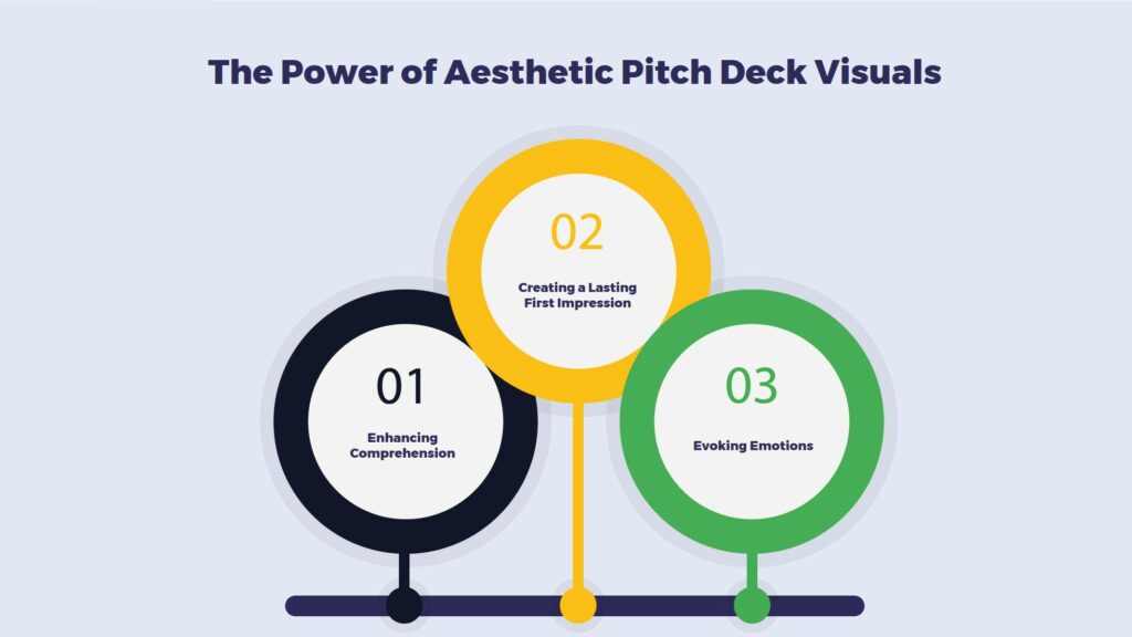
The Power of Aesthetic Pitch Deck Visuals

Creating a Lasting First Impression
A well-designed pitch deck with captivating pitch deck visuals can make a powerful first impression. Human brains are naturally drawn to images, and a visually appealing slide can grab the audience’s attention even before the presenter utters a word. This initial impact sets the stage for a more engaged audience.
Enhancing Comprehension
Pitch deck visuals have the remarkable ability to simplify complex information. Infographics, charts, and graphs can help convey data-driven insights more effectively than paragraphs of text. They allow the audience to quickly grasp key points, making the pitch deck presentation more accessible and engaging.
Evoking Emotions
Incorporating relevant pitch deck visuals can evoke emotions and create a connection between the audience and the content. A heartfelt image, a relatable metaphor, or a carefully chosen color scheme can evoke feelings that resonate with the audience, making the pitch more memorable and relatable.
The Risk of Distracting Pitch Deck Visuals
Undermining Message Clarity
While visuals have their merits, overloading a pitch deck with excessive images, animations, or flashy design elements can detract from the main message. An overly decorated slide might confuse the audience or divert attention from critical points, defeating the purpose of the presentation.
Potential Loss of Professionalism
In some cases, the pursuit of visually striking presentations might lead to a loss of professionalism. An excessive focus on aesthetics might give the impression that the presenter is more interested in style than substance. This can erode the audience’s trust and confidence in the content.
Cultural and Contextual Pitfalls
Pitch deck visuals can carry different meanings across cultures and contexts. What might be considered appealing and appropriate in one culture could be entirely misunderstood or even offensive in another. This potential misinterpretation can lead to miscommunication and unintended consequences.
Striking the Right Balance: Guidelines for Effective Pitch Deck Visuals
Relevance is Key
Every visual element should serve a purpose. Each should either reinforce the message, simplify complex information, or evoke the desired emotions. If a visual doesn’t fulfill these criteria, it’s best to leave it out.
Consistency in Design
Maintaining a consistent design throughout the pitch deck enhances the overall aesthetic and professionalism. Consistent fonts, color schemes, and layout contribute to a visually harmonious presentation.
Minimalistic Approach
Less can often be more. Opting for a minimalistic design helps in avoiding clutter and ensuring that the visuals don’t overwhelm the content. Each visual should have a clear role and impact.
Ready to Elevate Your Funding Journey?
Unlock the door to effortless investor funding with Easy Capraise! Say goodbye to the complexities of capital raising and hello to streamlined success.
Why Easy Capraise?
- Save over 550 hours of precious time.
- Benefit from expert guidance and captivating presentations.
- Increase your chances of securing funding with a tailored approach.
- Enjoy personalized solutions for businesses of all stages.
Discover Easy Capraise’s Tailored Solutions:
- Comprehensive document preparation.
- Crafting compelling pitch decks and teasers.
- Creating accurate financial models and fair valuations.
- Streamlined cap table management.
- Expert capital raising preparation and practice pitching.
- Proactive investor outreach and negotiation support.
Join the Success Story:
Businesses of all sizes trust Easy Capraise to simplify their investor funding journey. With a team of seasoned professionals, personalized solutions, and a track record of success, you can confidently step into the world of investor engagement.
The Elements of a Pitch Deck
This is your chance to capture the attention of investors by conveying your vision and mission succinctly. A concise yet powerful opening statement sets the tone for the rest of the presentation.
Identifying Potential Investors
Different investors have different preferences and focuses. Angel investors, venture capitalists, and corporate investors all seek specific opportunities. Understand their priorities and tailor your pitch accordingly. Conduct thorough research to identify investors who align with your industry and business plan. Target those who have a track record of investing in companies similar to yours. Personalized outreach is more likely to resonate.
Researching Potential Investors
Gather insights about potential investors’ investment history, preferred sectors, and portfolio companies. Craft your pitch to address their interests and concerns, demonstrating that you’ve done your homework. Building a connection with investors goes beyond financials. Identify shared values, interests, or affiliations that can create rapport and enhance your chances of making a lasting impression.
Tailoring Your Pitch Deck to Your Audience
Every investor is unique, and your pitch should reflect that. Customize your pitch deck to address the specific needs and interests of each investor. This level of personalization demonstrates your commitment and dedication.
Emphasize the metrics that matter most to each investor. If they value user growth, focus on user acquisition and engagement. If profitability is their priority, showcase your financial projections.
Importance of Ending Strong in a Pitch Deck
The closing moments of your pitch are what investors will remember most. Summarize the key points, reiterate your value proposition, and leave them excited about the possibilities your business holds.
End a pitch deck with a clear call to action. Whether it’s scheduling a follow-up meeting, providing more information, or requesting an investment, guide investors on the next steps they should take.
FAQs
Are visuals essential in a pitch deck?
Yes, visuals enhance comprehension and engagement, but they must align with the content’s message.
How do I prevent visuals from overwhelming the content?
Prioritize simplicity and clarity. Each visual should have a clear purpose and reinforce the key points.
Can I use generic visuals in my pitch deck?
It’s best to use visuals directly relevant to your fund’s story. Generic visuals can dilute your message.
What software can I use to create effective pitch deck visuals?
Tools like PowerPoint, Keynote, or design software can help create impactful visuals. Focus on simplicity and alignment.
Should visuals replace text entirely?
No, visuals should complement the text, not replace it. The goal is to enhance understanding, not replace essential information.
Conclusion
In the world of pitch deck presentations, the role of pitch deck visuals is a delicate balancing act. When used thoughtfully, visuals can enhance engagement, comprehension, and emotional connection. However, a cautious approach is necessary to avoid distractions, maintain professionalism, and respect cultural nuances. Ultimately, the effectiveness of pitch deck visuals hinges on the presenter’s ability to find the sweet spot between aesthetic marvel and distracting disaster.
Contact us
Good to have you here! If you have any queries, please leave your message. Our team will reach out soon:)
.


