Sales Deck Length Trap: Concise Cliffhanger or Incomplete Pitch?
[read_meter]
In today’s fast-paced business landscape, crafting an effective sales deck is essential for winning over potential clients. However, a critical question often arises: What should be the ideal length of a sales deck? Should it be concise, leaving the audience wanting more, or should it be comprehensive, providing every possible detail? This article delves into the sales deck length trap and helps you navigate the delicate balance between a concise cliffhanger and an incomplete pitch.
Ready-to-Craft Compelling Sales Decks and Secure Investments
At Easy Capraise, we understand the art of striking the perfect balance in your sales decks. Our expert team specializes in creating powerful presentations that engage, inform, and captivate your audience. Whether you’re a startup seeking funding or an established business aiming to expand, our tailored approach ensures your message shines.
Connect with us today to unleash the potential of your pitch! Reach out and contact Easy Capraise to learn more and take the first step towards securing your investment dreams.
Remember, it’s not just about the pitch; it’s about making an impact. Let’s raise capital together.
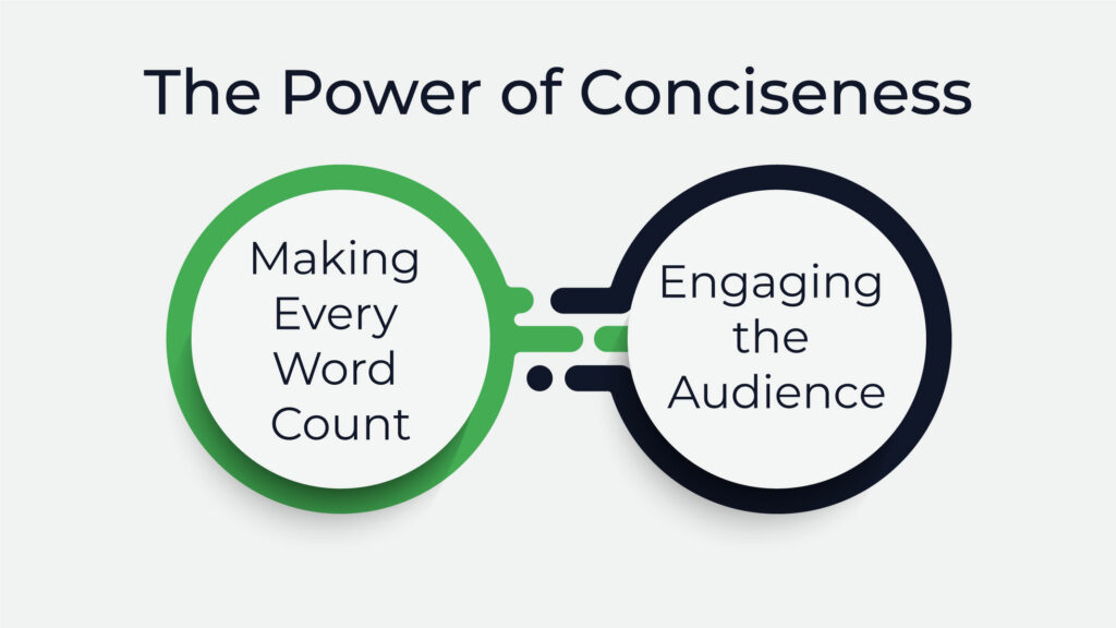
The Power of Conciseness

Making Every Word Count
In a world inundated with information, brevity is a virtue. A concise sales deck forces you to distill your message to its essence, allowing decision-makers to grasp your value proposition swiftly.
Engaging the Audience
A short and snappy deck can create a sense of intrigue, leaving your audience curious for more. Think of it as a trailer for an exciting movie—it entices without revealing everything.
The Allure of Comprehensive Decks
Providing In-Depth Information
On the other hand, a comprehensive sales deck leaves no stone unturned. It caters to analytical minds that seek detailed insights, making it a preferred choice for industries with intricate offerings.
Addressing Potential Concerns
Longer decks can preemptively address questions and concerns, building credibility by showing a deep understanding of potential challenges and providing solutions.
The Middle Ground: Balanced Approach
The concept of the “Middle Ground: Balanced Approach” entails finding a harmonious compromise between extremes. In the context of the article, it means tailoring the length of a sales deck to strike the right balance between brevity and comprehensiveness. By structuring the deck with a concise overview to capture attention and then delving into detailed sections, you cater to both quick-scanning readers and those seeking more information. Highlighting key points, using strategic cliffhangers, and catering to audience preferences all ensure that your message is engaging and memorable. Ultimately, this approach allows you to deliver a sales deck that intrigues your audience while conveying essential information effectively.
Structuring for Impact
Begin with a concise overview, followed by sections that delve deeper. This way, you capture attention initially and then cater to those seeking more information.
Highlighting Key Information
Identify the crucial points that need to shine. Utilize design elements to make them stand out, guiding the reader’s focus.
Teasing the Unveiled
Use strategic cliffhangers to hint at upcoming information. This technique maintains engagement and motivates the audience to keep reading.
Tailoring Deck Length to Audience
Analyzing Audience Expectations
Understand your audience’s preferences. Are they looking for a quick overview, or do they prefer comprehensive insights?
The Attention Span Challenge
Grabbing and Maintaining Attention
Attention spans are shrinking. A shorter deck helps counter this trend by delivering a punchy, memorable message.
Cognitive Load and Information Retention
Too much information overwhelms. A concise deck reduces cognitive load, aiding information retention.
Perfecting the Visual Elements
Impact of Visuals in Decks
Visual elements enhance understanding. Use images, graphs, and diagrams to convey complex ideas succinctly.
Balancing Images and Text
Balancing images and text is about achieving an equilibrium between visual elements and written content in a presentation or design. The aim is to ensure that neither images nor text dominate the composition, creating a harmonious synergy that enhances communication. Visuals can simplify complex ideas and engage the audience, while text provides context and details. Striking the right balance ensures that the visuals amplify the message without overshadowing it, and the text augments comprehension without overwhelming it. This dynamic equilibrium maximizes the impact of the overall content, making it visually appealing, engaging, and informative for the audience.
Practice Makes Perfect
A/B Testing for Optimization
A/B testing, also known as split testing, is a systematic method used to compare two versions of a webpage, content, or design element to determine which one performs better. In the context of sales decks, A/B testing involves creating two variations of a deck with a specific difference, such as length, and then presenting them to different segments of your audience. By doing so, you can collect data on how each version resonates with the audience and drives desired actions.
In the case of deck lengths, you could create one version that is more concise and another that is more comprehensive. By randomly showing these two versions to different subsets of your target audience, you can gather real-world feedback on which deck generates better engagement, captures attention, and leads to desired outcomes, such as increased inquiries or conversions.
Data-driven insights collected through A/B testing are crucial in making informed decisions. If one version consistently outperforms the other, it provides valuable evidence to guide your choice of deck length. A/B testing eliminates the guesswork, allowing you to optimize your sales deck based on concrete results and tailor it to what your audience truly responds to, ensuring that your pitch is as effective as possible.
Gathering Feedback and Iterating
Learn from each presentation. Collect feedback and refine your deck to ensure it resonates better each time.
The Psychological Aspect
A concise deck triggers FOMO (Fear of Missing Out), compelling the audience to seek more information, thus driving engagement.
Building Anticipation
Cliffhangers create anticipation, turning your sales pitch into a compelling narrative that the audience wants to see unfold.
FAQs
What if my audience has diverse preferences?
Prioritize the most common preferences but offer options for further information.
How do I know if my deck is too long?
If your message becomes diluted or loses focus, it might be too long.
Can a concise deck really provide enough information?
Yes, as long as it highlights key points and addresses potential questions.
Should I use the same deck for every presentation?
It’s recommended to tailor your deck slightly to each audience for maximum impact.
What’s more important: content or design?
Both are vital. Compelling content with effective design creates a winning combination.
Conclusion
In the world of sales decks, size isn’t the only factor that matters. It’s about tailoring the length to the expectations and preferences of your audience. Strive for a balanced approach, capturing attention, providing key information, and leaving your audience eager to know more.
Contact us
Good to have you here! If you have any queries, please leave your message. Our team will reach out soon:)
.


